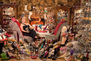
Kitsch (/ˈkɪtʃ/; loanword from German) is a low-brow style of mass-produced art or design using popular or cultural icons. Kitsch generally includes unsubstantial or gaudy works or decoration, or works that are calculated to have popular appeal.
 A gnome or two in your garden can be cute, even enchanting. But when you have a whole herd of zombie gnomes on your lawn, you have gone to the dark side, my friend. I'm suggesting that you are dangerously close to becoming a 'Collector'.
The Collector isn't your average collector of a few interesting trinkets or articles for investment or re-sale... rather, they've become a caricature of their obsession. While they may have a few gems in that mountain of gaudy treasure, unfortunately, those gems are lost in the kitschiness of the whole.
Check out this kitschy dashboard. I can't imagine that anyone viewing it in a business environment wouldn't find it tacky. Never mind that it doesn't present the information in a manner that is immediately understood.
 |
| Dashboard for the Executive who lives in his car |
If I was presented with this dashboard, I would be concerned that my analyst was more concerned with getting kudos for the cool factor, than actually knowing how to analyze data and present me with important or actionable information.
Memo to Management:
If someone is trying to sell you on reports, dashboards or software solutions that contain any of these items - you are being hosed by a slickster.
Dashboards do not need bling. They need to engage yes, but kitsch isn't what does it.
If someone tells you that you need these types of charts because bar charts are boring, know that this is a red herring. Boring has nothing to do with the bar chart; it's the analyst that lacks the skills or creativity to build a dashboard that allows you to SEE the information and interact effectively.
Sincerely, a sincere analyst who has nothing to gain. See when only the glib win.

Donuts and Pies
Unfortunately, donut charts are all the rage right now (among graphic designers building dashboard templates). They use them because they do add interest as part of the overall design of a dashboard. Unfortunately, these dashboards are not about analyzing data or allowing the user to gain insight and the donuts are merely kitsch; they have popular appeal, but no real substance.
We don't use a type of chart because it looks cool, we use it when it's the best possible way to present the results. Personally, I like the look of these dashboards (including pies and donuts), but I have yet to build a dashboard like this for actual use in a business setting. Simply because they haven't worked. They are easily replicated in Tableau, but when it comes to applying real data with a real need for information, they fall short. Mostly because there is a demand for real estate when you are building a dashboard - pieces of information vying for attention. We decide their placement primarily based on importance and communication flow.
Icons
 |
| Click to view |
This dashboard by Ryan Sleeper is an example of using icons that help the user immediately identify and differentiate between the subjects.
Using icons in this manner would be completely appropriate on a business dashboard. However, watch that you only use a field with a few categories - too many and the user will get confused.
This dashboard by Matt Francis is another way to use icons that could work for business dashboards.
This dashboard addresses a serious, sobering subject and the use of the bus icons to display the number of children who die every day from Malaria has quite an impact.
 |
| Click to view |
Appropriate Kitsch
Can you ever have kitsch on your dashboard?
Hell yes!
There are lots of kitschy dashboards on Tableau Public. But they are often about pop culture, and the audience is the web (not a management team), so it works. They're fun and playful and some are even over the top, but they aren't pretending to be a business dashboard. What I love about them is that these analysts are exercising their creativity bone in an appropriate venue.
 |
| Click to view |
This Hello Kitty styled dashboard by Jewel Loree is particularly delightful and kitschy, but it's also very well thought out and polished.
And informative. If I was in the market for Hello Kitty brass knuckles, this would be my go to viz for pricing information.
 |
| Click to view |
Yes, it's kitschy! Appropriately so. Personally, I wouldn't be able to find my favorite donut without the images.
The dashboard is also quite simple and clear - the user instantly gets the message "How fattening is my donut?"
These dashboards are fun and kitschy, but their authors have still put some time and thought into making them more than mountains of gaudiness, so the message still gets through.
That's what we need to keep in mind anytime we're building dashboards, "Am I helping the user understand the message? Or am I drowning out the message with my design?"


