 |
| Click to view the interactive at the NYT by Shan Carter and Kevin Quealy |
There's an amazing bunch of people on that design team - and they are very generous with sharing their expertise; you can follow their process at Chartsnthings. Much of their interactive work is created with d3.js which I haven't learned and had always hoped that eventually I might be able to produce something similar with Tableau.
Well, I think I have. It's not perfect, but it's close.
This chart doesn't render as smoothly as d3 and I had a buggery of a time nudging that sentence into place as it moves around when embedded. If I wasn't trying to replicate the other dashboard I would do that differently (perhaps put the information in the mark label on the chart, which would also render more smoothly).
I haven't replicated the chart exactly as I found the original a little confusing. When you slide the bar across the months, the y axis holds the percentage change values, which I found less, rather than more insightful. I just know that if I gave this to management I would be hit with a million questions (I'm an exaggerator) about what is going on with the left side of the bar.
Here's how it's built:
The chart is a dual axis chart with a before and after dimension which is used to adjust the color and size of the lines on either side of the chosen date. The bar is a reference line set to a date parameter.
1
Create a begin (date) parameter which steps by months
2
Create a City Parameter from the City field.
3
Create a bunch of calculated fields:
before/after field
If [Date]<=[begin] THEN "Before"
ELSEIF [Date]>=[begin] THEN "After" END
April, 2013 field
DATE("4/1/2013")
Refmonthsdot field (this field contains only 2 values - one for April, 2013 and one for the parameter begin date for the selected City parameter)
IF DATETRUNC('year',(MAX(Date)))=DATETRUNC('year',[APR-13])
and DATETRUNC('month',(MAX(Date)))=DATETRUNC('month',[APR-13])
and ATTR([City])==[City Parameter] AND ATTR([before/after])= "After" THEN
SUM([Value])
ELSEIF DATETRUNC('year',(MAX(Date)))=DATETRUNC('year',[begin])
and DATETRUNC('month',(MAX(Date)))=DATETRUNC('month',[begin])
and ATTR([City])==[City Parameter] THEN
SUM([Value])
ELSE NULL
END
city color field (this is to color the city trend lines differently before and after the selected date)
If[City]==[City Parameter] AND [before/after]= "After" then "1"
ELSEIF [before/after]= "After" then ".5"
ELSEIF [City]==[City Parameter] AND [before/after]= "Before" then ".1"
else "0" END
city size field (this is to size the city trend lines differently before and after the selected date)
If[City]==[City Parameter] AND [before/after]= "After" then "1"
ELSEIF [City]==[City Parameter] AND [before/after]= "Before" then ".1"
else "0" END
RefmonthsdotCITY
IF DATETRUNC('year',(MAX(Date)))=DATETRUNC('year',[APR-13])
and DATETRUNC('month',(MAX(Date)))=DATETRUNC('month',[APR-13])
and ATTR([City])==[City Parameter] THEN
ATTR([City])
ELSE NULL
END
RefToday%
IF DATETRUNC('year',(MAX(Date)))=DATETRUNC('year',[APR-13])
and DATETRUNC('month',(MAX(Date)))=DATETRUNC('month',[APR-13]) THEN
(SUM([Value])-LOOKUP(SUM([Value]),(DATEDIFF('month', max([APR-13]), max([begin])))))
/(LOOKUP(SUM([Value]),(DATEDIFF('month', max([APR-13]), max([begin])))))
ELSE NULL
END
4
Place the Date field on the column shelf, and the value and Refmonthsdot fields on the rows shelf. Add the before/after pill to the filter section - set to use all. Place the City pill on the Detail.

5
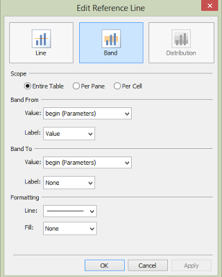
Add a reference band to the x-axis (Month of Date)
Set the scope to the Entire Table, banding values using the begin Parameter. Set the label for the first band and the formatting to line. Apply.
6
Right-click on the Refmonthsdot pill and select Dual Axis. Right-click on the axis and select Synchronize Axis.

7
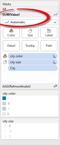
Now the line marks. For the Value field (lines) add city color to the Color section, city size to the Size section.
Select the colors you want - 1 and .5 will be on the right side of the reference bar, so you'll want these darker than .1 and 0 which will be on the left. 1 and .1 will be the selected city. You'll want to color the other two (.5 and 0) in shades of grey.
Manually sort the city line size to: 1, .1, 0. This will bring the selected city to the front.
Adjust the line sizes and select Reversed.
8
For the circle marks, select the field Refmonthsdot and select Circle. You'll want to adjust the size and color to match the selected city line color.
Add the fields RefToday% and RefmonthsdotCITY to the Label section. You can then format the labels how you want them and select 'Always show'.
9
Lastly, hide the all three axis by right-clicking on them and un-selecting 'Show Header'.
The rest is just formatting borders and tool-tips, etc.
Now that I've created this, it's going in my toolkit folder so in the future I can replicate it quickly. My toolkit folder is full of workbooks I've downloaded from other bloggers who have graciously shared their knowledge and tricks. It also has workbooks with views that didn't make it into the final dashboard, but that I couldn't bear to delete, or workbooks with calculated fields that I often forget how to do (really, sometimes I look at one of my old dashboards and have no idea how I did that, until I dig into the views and fields). That folder also has tons of links to other helps and tips. I highly recommend you create a toolkit folder for your Tableau Repository.
Hope that helps. Cheers!


