 |
| CLICK ME! |
I don't know much about font combining (other than what I've read here), so I try to keep the number to a minimum and try not to have them competing for dominance.
This is pretty much the list of fonts I use in Tableau. I know they aren't exciting, but I can count on how they will behave on different Windows or Mac versions and different browsers. Besides, when it comes to dashboards, I don't want the font to be the star anymore than the colors. The font is there like any other element; to help convey the message that the data contains.
Please note that I'm talking about work, work here. When it comes to play visualizations, all bets are off and all fonts are fair game, even ComicSans.
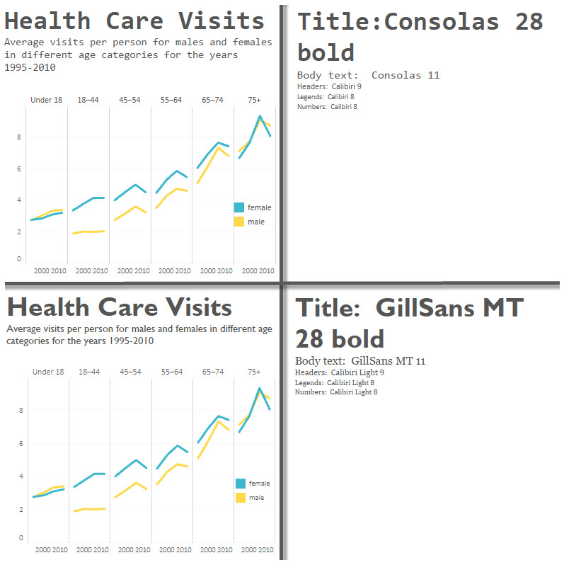
 When the font is very distinct, such as Consolas or GillSans, I tend to use it for most of the dashboard (with the exception of the chart labels and headers), but with varying sizes.
I try to keep the sizes uniform for the same elements (eg. all headers 9), so that I don't forget on each chart.
When there's instructions to the user, such as "Select from filter", I'll use the same body font, only smaller, or italic, or in a distinct color. It all depends on what else is going on on the dashboard.
Here's two examples of 3 fonts in use. In the first case, the title is sans-serif and the body is with serif. The opposite is true for the second chart. All of the chart elements and legends are in the same font.
In the second chart, I've lightened the axis labels on the chart as the font seemed too large, even at 8 pt. When something doesn't seem to stand out like I want it, rather than bold it or make it larger, I usually try to diminish other things around it. That way, I'm not constantly turning up the volume on the viz, but turning it down.
Feel free to download the workbook to keep these font examples handy. Cheers!

