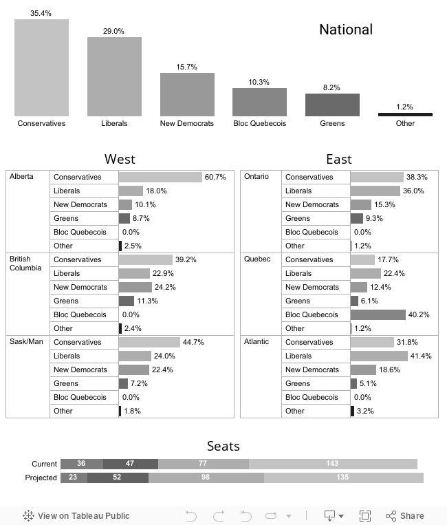
Just for fun, I spent a few hours today searching for Canadian News Media viz's using Tableau. Other than Chad Skelton at the Vancouver Sun (who has done some fantastic visualizations over the years), I haven't found anything yet.
 Then I came across this visual in the Globe and Mail presenting the current party standings in the latest poll (click for larger view). My father was sitting close by reading the paper and we started discussing the potential of a spring election. When I showed him this visual he was baffled. It took a while for both of us to identify the key points. It killed the discussion that we normally would have had.
Now, this isn't a horrid visual (the layout is particularly effective), but a good visual shouldn't require that the user do another level of analysis in their head. The visual should tell the story, just as a journalist would. The pertinent facts should stand out. Simply presenting the votes in bar charts rather than donuts would have helped a great deal.
Because I'm a little type A, I entered the information in a spreadsheet and quickly uploaded it into Tableau Public. It took me longer to do the data entry than it did to produce this simple dashboard. I separated the regional charts into West and East (if you're a Canadian, you know that this is how we discuss this information) and didn't bother with assigning party colors because I was going to print it in black and white. Then my father and I had a conversation.
I can't help but think that the analyst who produced this would create stunning visualizations using Tableau, plus they would have the ability to provide interactivity.
Federal vote and seat projections as of Jan. 17, 2011