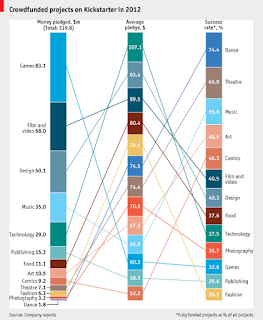
 I confess. I hate stacked bar charts almost as much as I hate pie charts. Too often I find them used with too many categories to be informative and unless the data distributes nicely, there's always one or two categories that nearly get squeezed out of existence. Moreover, unless they are labelled with values, I have trouble judging their difference from one another. Just like I have trouble judging and comparing pie wedges.
I recently came across this post on the Economist blog where they present the same issue in 3 different charts. How to present a comparison of multi-categories with multiple measures.
" WHAT is the best way to display information? The data geeks at The Economist struggle with this question every day. On January 17th we produced a daily chart about Kickstarter, the largest crowdfunding site. It showed projects by three measures—money pledged, average pledge and success rate—using traditional bar charts... How could we have adapted the technique to the data a bit better? "
Personally, I find all of them limited and difficult to absorb to some degree. I find the top chart to be the worst actually, too many lines, values, measures and combinations to keep straight in my head. Given my feelings about stacked bar charts, my preference would be the chart on the left below, but with Success rate presented on the left, because it's most important (the ultimate goal, dependent variable) and the first question I would ask of the data. I think that if you are presenting information in a static manner then it's best to keep it as simple as possible and I like how clean this chart is and how it highlights only two categories.
At a glance, here's what I'd take away from it - Dance is most successful, with the least amount of funding and Games receive the most funding, but are not the most successful.
If I wanted to add more detail, then this is where I find Tableau invaluable. The actions, particularly highlighting can do a lot of the brain work for me. Instead of trying to cram all the information into one chart, I put 3 charts on 1 dashboard, relying on the highlighting function to show where each category ranks by 4 variables: success %, dollars pledged, average donation size, and number of projects.
With this dashboard, I created a highlighting action to activate on hover for categories. I've also used dark colours for the categories because I think they stand out best when highlighted. For the dollars variables (# and Average) I created a dual action chart where the average values only appear when highlighted. Try it out - Hover away!
So what do you think? Which works best for you?


